DELVAUX LE 27
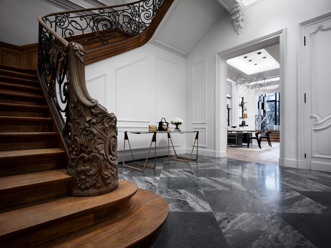
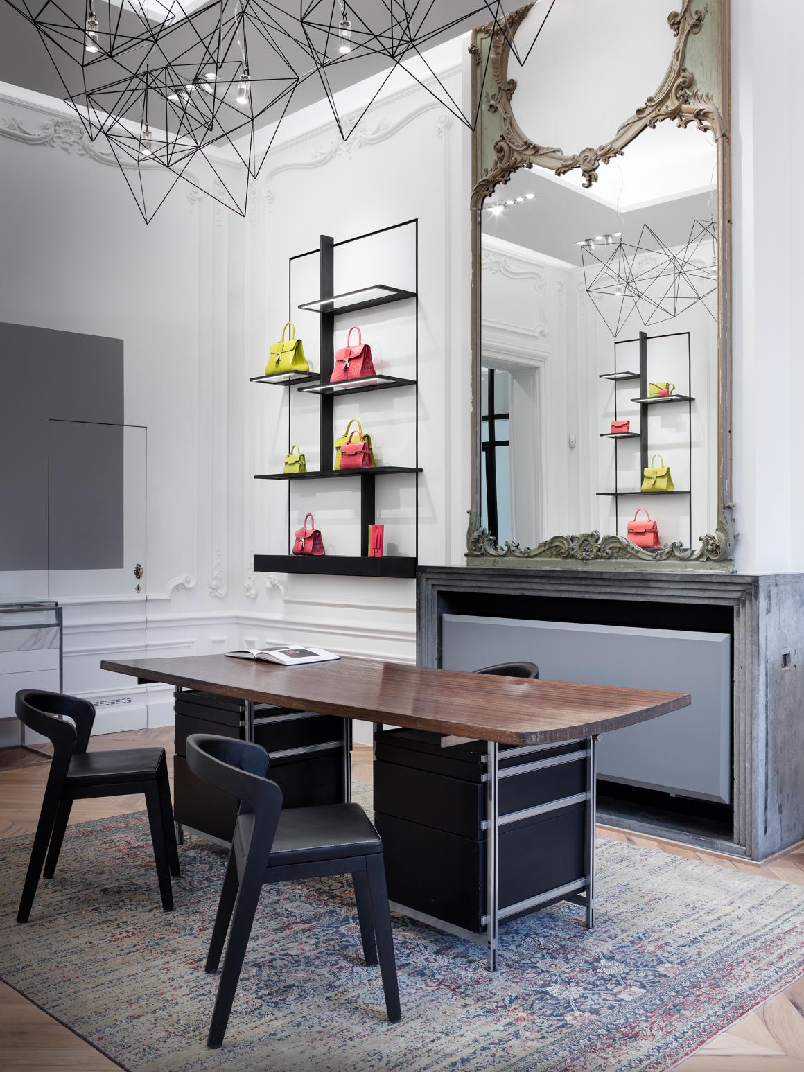
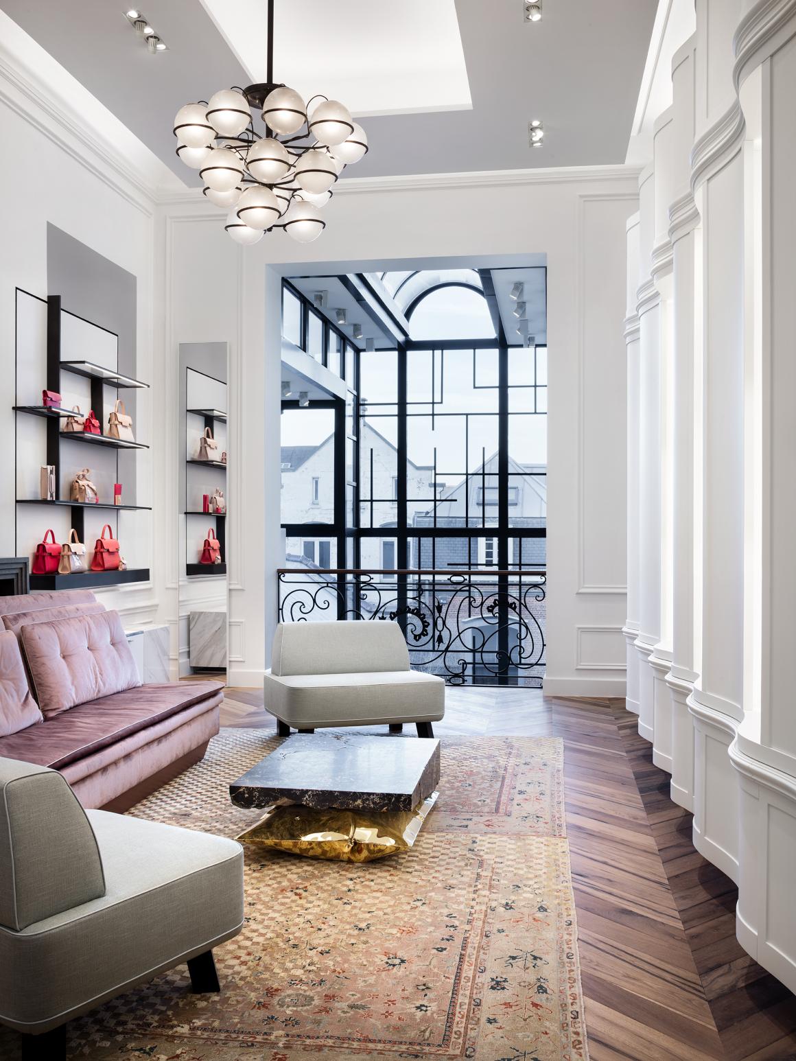
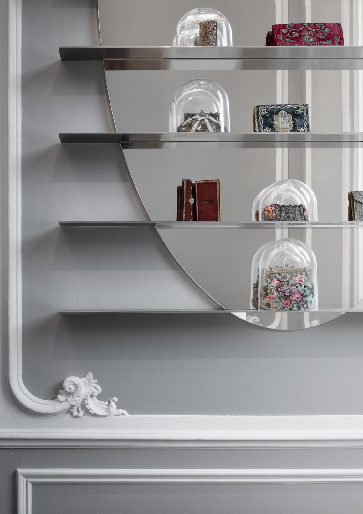
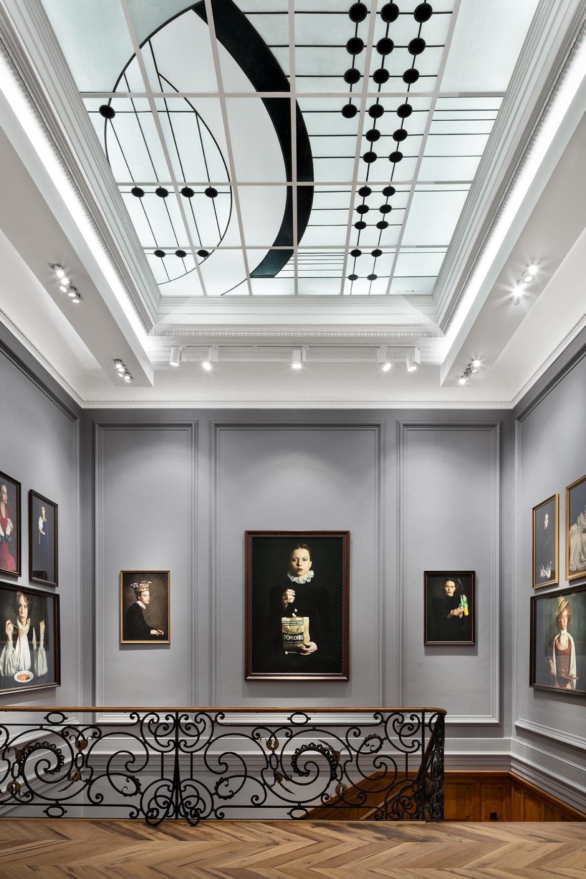
The Delvaux flagship presents a unique, custom-designed concept blending contemporary design with its historical environment. Spread across two floors, "Le 27" preserves its original wall structure and high ceilings, offering a modern take on early 20th-century Belgian modernism.
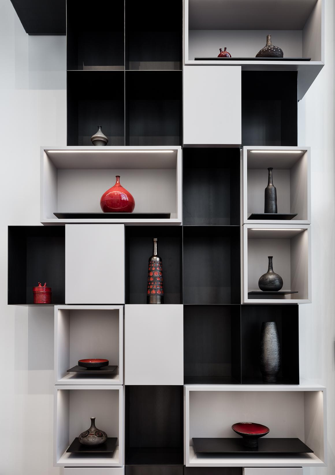
Wall displays, inspired by De Stijl and Mondrian, feature a symmetrical layout offset by unconventional light-grey bands. These panels are combined with sleek cupboards and consoles in minimal forms, elevated by rich Art Deco materials. The meticulous craftsmanship in both elements subtly nods to modern design masters and Delvaux's detail-oriented expertise. Our design achieves a balanced harmony between classic and modern aesthetics through the contrast of seemingly simple and luxurious materials, as well as ordered and unconventional elements.
PROJECT
Vudafieri-Saverino Partners, Tiziano Vudafieri and Claudio Saverino
DESIGN TEAM
Elena Pessina, Elena Salvaterra, Alice Brunello, Constanza Mellado
PHOTO
Santi Caleca


